Data drives future-Introduction on our low carbon & environment big data platform
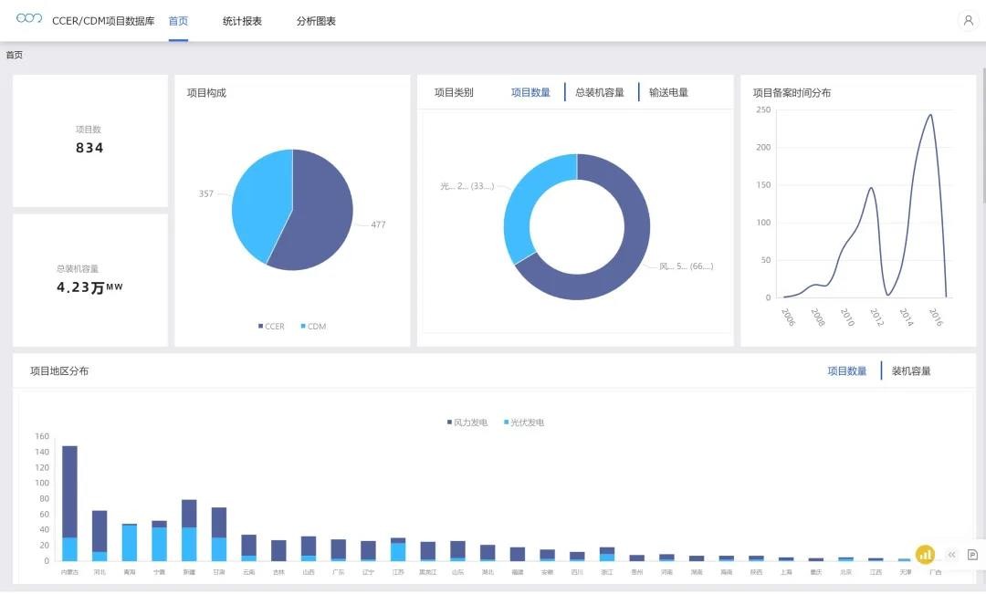
Home page includes the basic information of the platform
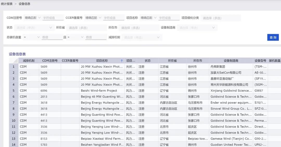
Then you can enter the words or symbols you want to search, our filter and search engine can help you find the project information you are looking for.
Let’s explore our data analysis and visualization functions!
National distribution of projects
For the current wind power and photovoltaic emission reduction projects (including CCER projects and CDM projects), the installed capacity is reflected by the size of the bubble, and the distribution of the projects can be seen by different power generation types.
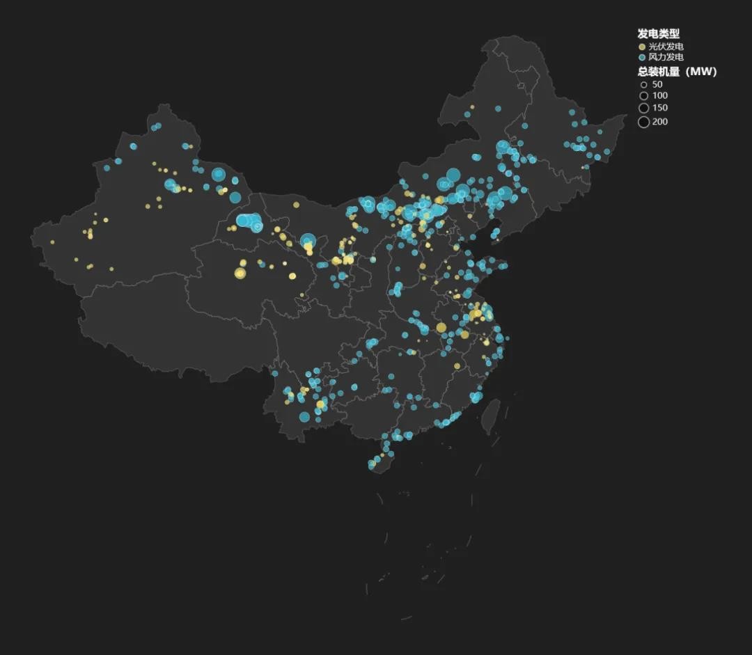
It can be seen from the figure that the number and installed capacity of wind power projects are generally higher than those of photovoltaic projects, and the distribution is relatively wider. Among them, eastern Inner Mongolia (Chifeng area) and Gansu are more distributed, and North China and Northeast China also have certain distributions; And the wind power projects in the southeastern region are mainly distributed in coastal areas. Relatively speaking, photovoltaic power generation projects are only significantly distributed in provinces such as Jiangsu, Inner Mongolia, Gansu, Xinjiang and Ningxia.
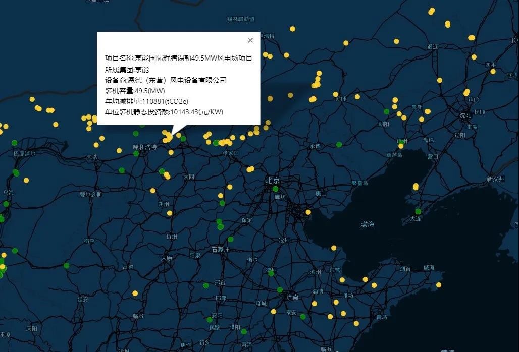
Of course, the map can also be zoomed and displayed the basic project information of a single project.
Project quantity/installed geographical distribution analysis chart
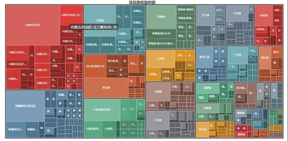
By counting the distribution of photovoltaic and wind power projects (including CCER and CDM projects) in various geographical areas, the number of projects and/or the rectangular tree diagram of installed capacity can be drawn. In the analysis graph, you can perceive the number of projects in each province and city or the total installed capacity according to the size of the color block. It can be seen from the figure that the number of photovoltaic and wind power projects in Inner Mongolia, Xinjiang, Gansu, Hebei and Ningxia ranks in the top five.
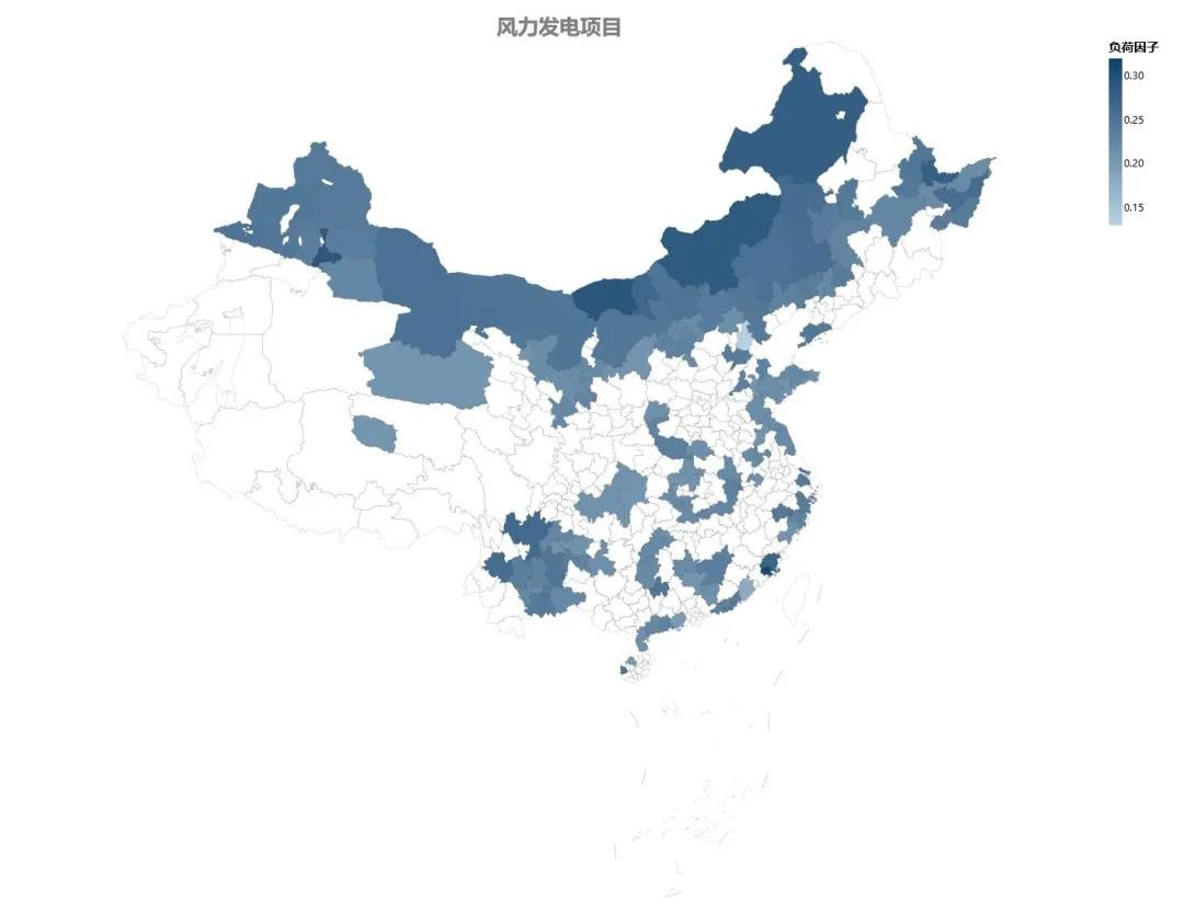
Load factor of each area.
The figure below shows the differences in the average load factor (utilization hours) of wind power projects in cities and regions across the country, which partially reflects the geographical distribution of wind resources across the country. It can be seen from the figure that the areas with darker colors, that is, projects with better wind resources, are mainly concentrated in the eastern Inner Mongolia area.
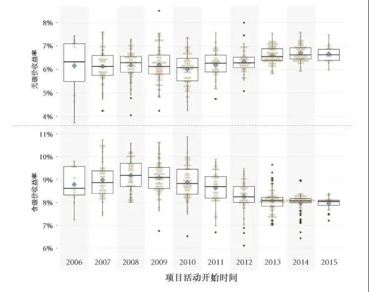
Analysis on Projects Investment
The box diagram below reflects the IRR (internal rate of return) under the carbon-free income of the wind power project and the IRR after adding the carbon income with the start time of the project. We can see that the IRR variance of the early CDM projects is still relatively large. As time goes by, the IRR with no carbon gains infinitely approaches 6.5%, while the IRR with carbon gains converges to 8% infinitely. The reasons will not be listed here.
Analysis based on power generation group
We have also linked emission reduction projects with major power generation groups. In this way, analysis of the number of projects, installed capacity, investment, electricity and emission reduction can be given respectively.
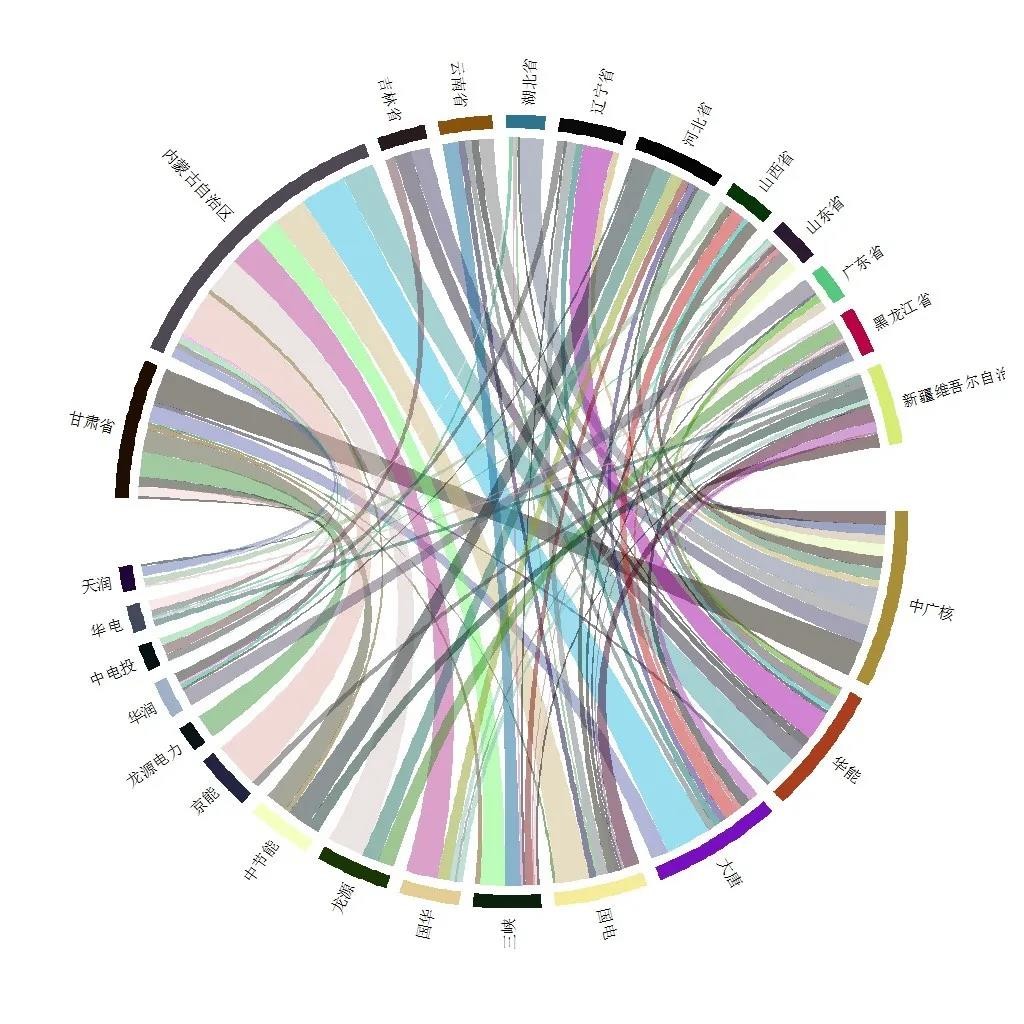
For example, according to the installed capacity of each group's application for emission reduction projects in each region, the distribution of installed capacity of each group in different geographical areas can be calculated. The following figure is a graph of installed capacity accumulation given by the group as the abscissa. You can compare the total installed capacity of the wind and solar emission reduction projects developed by each group at a glance. Place the mouse on the graph to see the installed capacity of a group in each region capacity.
This figure can also be turned into the following figure. The distribution of each group in each province and the proportion of installed capacity of each group in each province can be shown from the picture, which can to a certain extent the availability of different groups Explore the development trend of renewable energy. It can be seen from the figure that each group has a large amount of wind power/photovoltaic assets in Inner Mongolia, and Huaneng Group has invested more in Liaoning Province.
Analysis based on equipment manufacturers
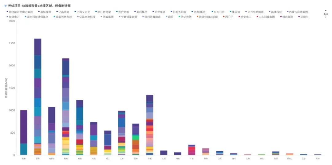
Similarly, by counting the supplier information of major equipment for emission reduction projects, analysis of the number of projects, installed capacity, investment, electricity and emission reductions of different equipment manufacturers can be given.

For example, the installed capacity of different suppliers in photovoltaic projects can be obtained. Since most photovoltaic projects before 2016 have applied for carbon emission reduction projects, this analysis can reflect to a certain extent the market of equipment vendors in different regions in the year scale.
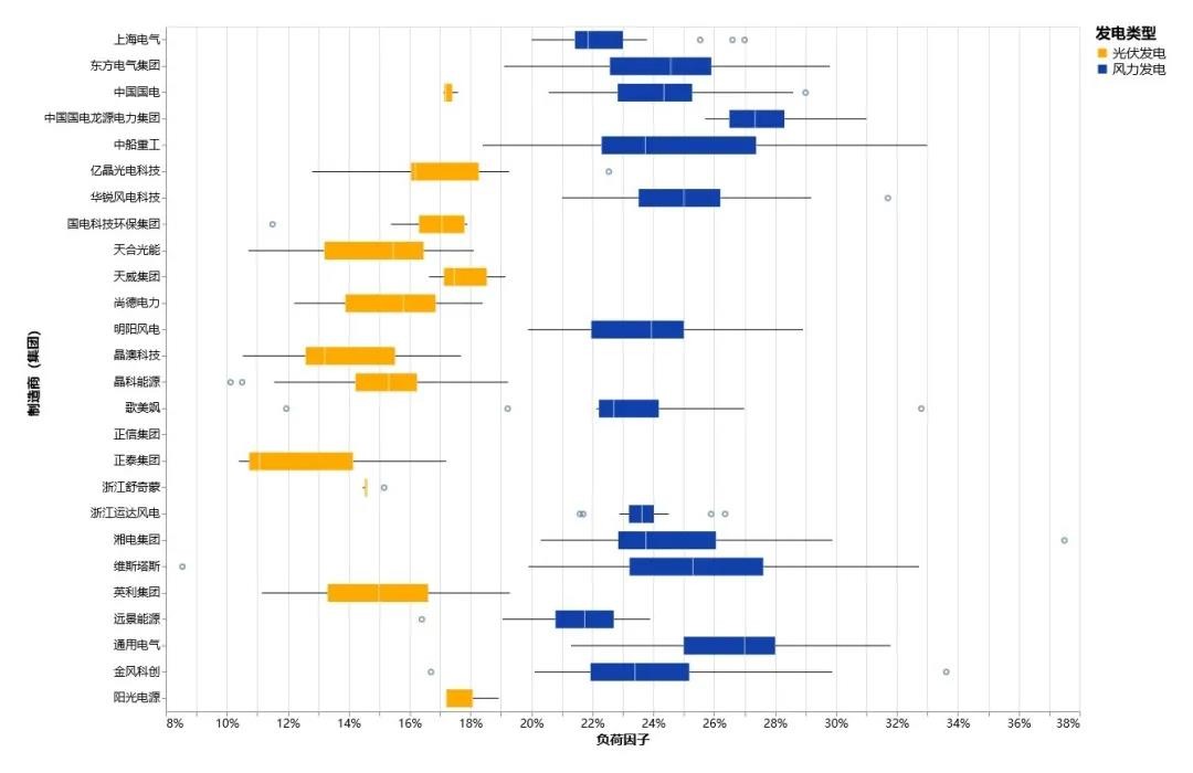
The power generation capacity of different projects is not only related to geographic location, but also related to specific equipment models and corresponding manufacturers. The following figure compares the distribution of load factors (utilization hours) of equipment manufactured by some manufacturers, reflecting the manufacturer's equipment level and design capabilities to a certain extent. The specific differences will not be commented here.
Linkage analysis of project information
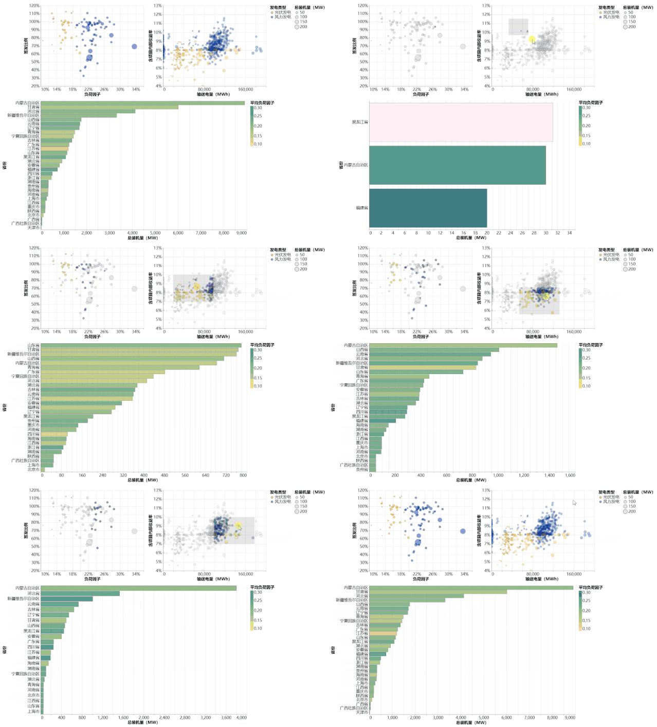
Through the multi-dimensional linkage analysis of specific projects, it is possible to conduct in-depth analysis on the construction, investment, income, and efficiency of CCER and CDM projects. The following figure links the project's design load factor, actual issuance ratio, transmission power, rate of return, and geographical distribution.
Changes in project load factor over time
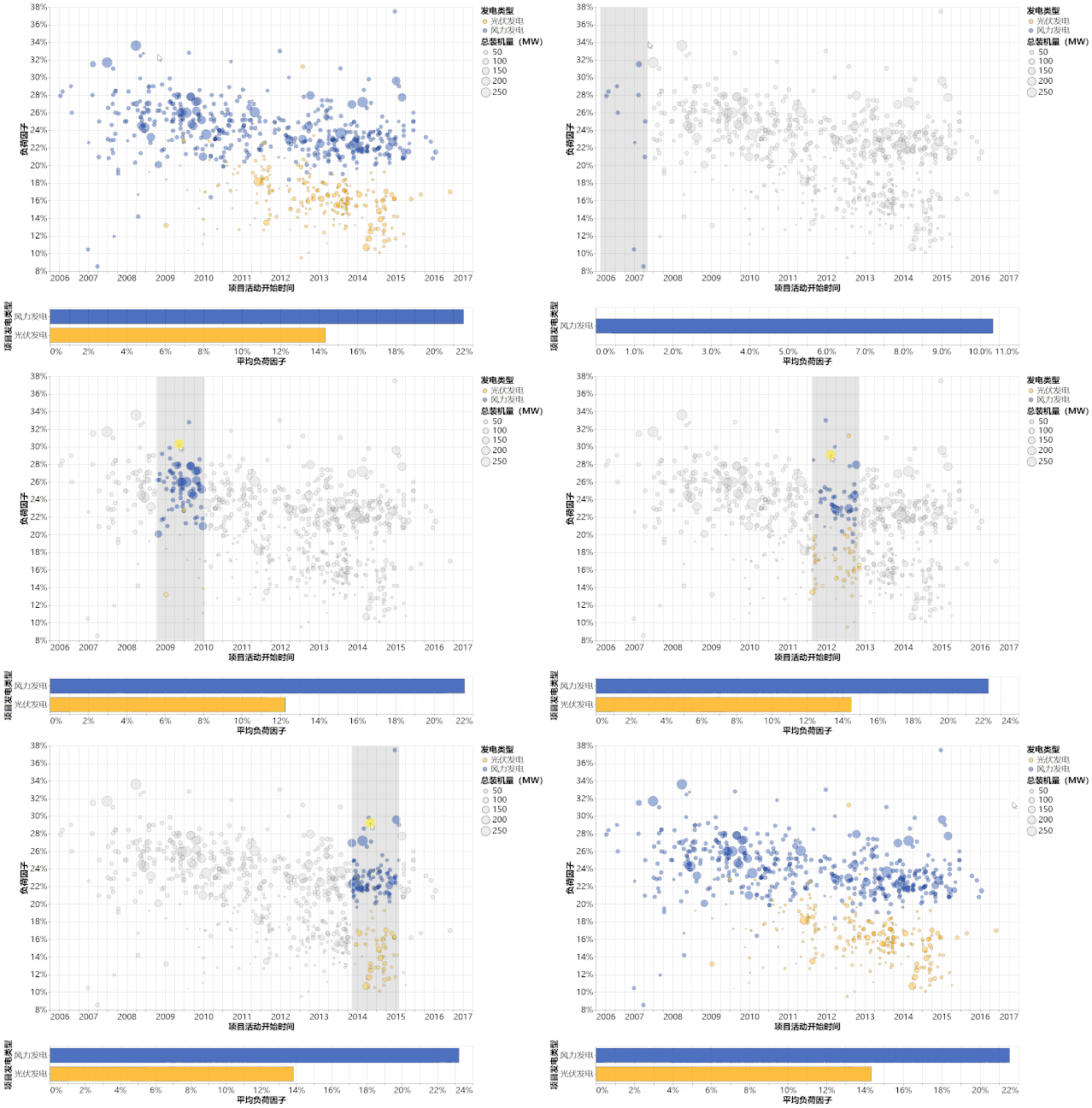
Through the distribution of project data in the time series, the corresponding tracking analysis of the project construction can be carried out. The following figure uses the design load factor as the analysis object to analyze the time of the two types of power generation projects. From an overall point of view, the load factor of wind power projects is significantly higher than that of photovoltaic projects, but the load factors of the two types of projects have a gradual downward trend with the start of project activities.
Changes in investment over time
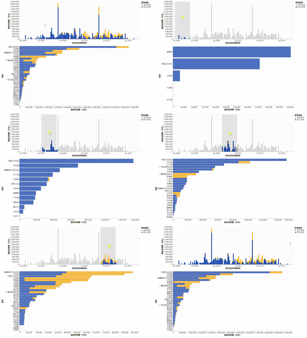
Another factor that changes over time is the total project investment. As can be seen from the figure below, investment in wind power and photovoltaic projects has generally maintained stable fluctuations since 2007, but overall photovoltaic investment has an increasing trend. In addition, the map also links the geographic location of the specific investment amount, making it easy to view the spatial distribution of investment in a specific time period.
The current data coverage of this database is still limited, and we will include more projects in the next phase. In the future, our Big Data team will gradually structure and visualize the data we have accumulated over the past 10 years, and look forward to bringing you more data products in the near future.